Bospherry
Visual Identity Design
Creating a new brand identity for the ferries of Istanbul, sailing between the Asian and European sides of the city.
To many of the city’s residents, the ferry rides are an essential and one of the most beautiful parts of Istanbul. With the first steps you take onto the ferry, you are filled with a burst of fresh smell of the sea. As the motors start perfectly on time and the ferry slowly moves away from the port, you leave the chaos of the city behind and sail into a tranquil experience. Sitting outside, all your five senses are gratified with the refreshing sound of the waves and the breeze brushing your cheeks.
.jpg)

The logo design was inspired by the shape and colors of the wake of the ferry that adorn the view on the ride. The overall shape and geometry of the logo is designed to spark feelings of tranquility.
The logo is symmetrical on the horizontal axis, representing the side-to-side travel of the ferries, connecting Asia and Europe.
The negative space between the upper and lower halves of the logo figuratively represent the strait of the Bosphorus where hundreds of ferry ride each day.
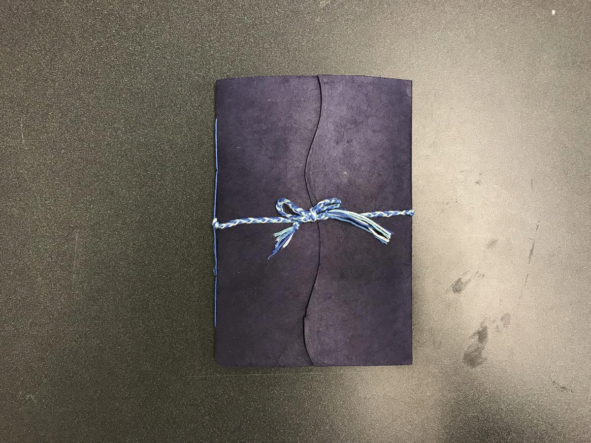
Hand-bound Visual Identity Booklet